There are also many trends in website design field which often comes and goes like fashion trends in every season. Sometimes trends are necessarily dictated just like responsive website design. The decision to follow the trend must depend on the requirements of your client and their business. The decision should never depend on one matter that is what the cool sites are doing and follow it blindly. There is one saying that the site built only based on trends they may be quickly out of the date.

Here are some of the website design trends which will be poor so, you might think twice before using them.
- Hamburger Menu:
Hiding everything under a hamburger menu might be a bad decision for your website designing. As we all know mobile devices became common gadgets, designers started simplifying navigation and hiding it under a hamburger menu. This trend is slowly creeping in the desktop version of websites too.
Here is an image which describes the hamburger menu clearly. if you click hamburger menu it expands the full menu of the website.
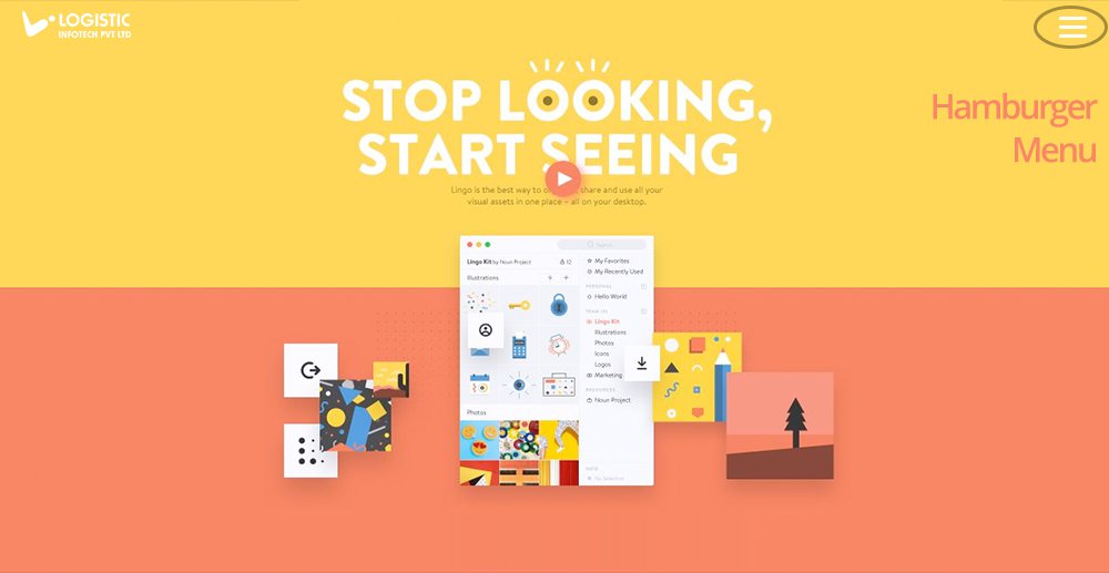
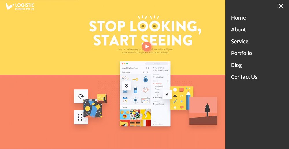
No doubt, placing navigation menu under a hamburger menu makes website cleaner, sleeker and well structured. Most of the people familiar with this pattern, But this is not the magic which works for all site and it can also reduce discoverability.
The result can be harmful to e-commerce sites and new sites, where discoverability of topics is disappointing to the experience. It might be unnecessary friction for forcing users to open the navigation menu.
Disadvantage of Using Hamburger Menu
- Higher Bounce Rates On Landing Page:
Users will not be interested and will not stick around if the navigation will not be proper because it would be hard for them to browse the website.
- Can’t Track Where Users Are Clicking:
Are you sure, users are clicking the hamburger menu? If not, it might be possible that the bounce rate can be high. You can check the clicks by many tools available in the online world.
You can observe user’s behavior and determine whether you should use a hidden navigation drawer on a full desktop site. Don’t ever think to sacrifice usability and discoverability for your website.
- Front-Page Carousels(Slider):
Nowadays, carousels seem to be more trending in website design trends. They can attract more visual interest and reduce clutter. But if you are over using it then it can make a lot of feeling like this is a kind of cookie cutter website.

Disadvantage of Using Front-Page Carousels:
- Carousels Are Bad For SEO:
The lack of content means it is difficult to get Meta tags from the page. We know that Google no longer crawls Meta keywords so it will fetch keywords from a web page. You can get the word count below the carousel in the body of the page. Sliders mostly contain headers which are wrapped in H1, these changes with the sliders change.
- Slow Down The Performance:
Mostly carousels contain high-resolution images but well optimized that can slow down the load time of the front page. The front page is the most important page of the site which should load faster. Sliders sometimes use JavaScript or jQuery which might be speed-breaker for the performance of the front page.
- Pushes Content Below The Fold:
Above the fold content is not much important as it was once upon a time. Google still don’t recommend pushing content lower down the page. While the search giant’s recommendations are based on ad content above the fold, a carousel doesn’t offer much – it is just pretty.
- Inaccessibility:
The best framework can’t solve the issues of accessibility which surround carousels as there are much more to address.
The analysis says that only 1% people out there who clicked the carousels, many has ignored it and don’t note about the content this tends because the phenomenon which is known as banner blindness. This means not that you should not use carousels but you should have good enough reason to put it in your website design as per your client’s requirement but it should be crafted carefully and well optimized to ensure that they are not compromising UX and accessibility.
- Parallax Scrolling:
In current trends, we have seen there are many sites using the parallax scrolling. Parallax technique makes foreground and background content scrolling at the different speed, creating fancy styles, with good effects, but it is debatable if it can be described as having really good UX.

Disadvantage of Using Parallax Scrolling:
- Bad For SEO Practice:
Mostly those sites which are using Parallax scrolling tend to be made up of a single page. There is usually little use of content in it, which can be crawled by the search engines.
- Slow Down The Performance:
As we all know that parallax scrolling uses heavy graphics and JavaScript so it might be possible that the page can get clogged up on load. It’s certainly like a headache for mobile users. When parallax is used, load times on mobile can be very poor because it is using JavaScript.
- Affect Visitors Negatively:
The research on parallax found that there is more fun on parallax site than non-parallax sites, but some of the users experienced motion sickness and usability issues while interacting with parallax websites.
No doubt, it’s looking like a cartoon and tells story using graphical elements as you move down the page which is the strength of the parallax scrolling. It tends to be slower than any other commercial websites as per the reports from the GT Metrix.
- Complex Load Screens:
In earlier days when you go to any website which has a flash animated load screen for which you have to sit compulsory to enter a site. There is no any clue about what kind of site it is. Users get perplexed because there is not even navigation option. Let’s take an example that there is a site with a counter that slowly climbing to 100%. It is somewhat more tedious than normal sites. After waiting for some time there is a site concept in front of you and that could leave you thinking why I have wasted my time to build up.

You can see in the above image that there are all good use of graphics and sounds. Initially, it loads by bouncing one by one. It takes four seconds to load completely and uses simple music to keep things really interesting. It is interacting too while moving the mouse the stars also moves in the background process. This can be used to keep user active with some activity.
- Too Much Use Of JavaScript:
Nowadays everyone is using JavaScript. JavaScript can slow down your website and user will not stay around if your site is too slow. JavaScript will be more effective while any other language can’t work properly. You can implement load screens like sliders using JavaScript. JavaScript can be now found in lacks of library and frameworks like Angular.js, Knockout.js, and Backbone.js etc.
Disadvantages of Using JavaScript:
If you are over using the JavaScript then you can hurt your site like:
- Increased Load Time:
It will take time for loading due to sliders and plug-ins which create many JavaScript files and CSS. Make sure that all of the JavaScript load from one file by minifying.
- Bad Impression for Mobile Browsing:
It might leave bad impression towards visitors if it will take more time to load the page or loading speed is slow.
- Breaks Some Parts Of Site Due To Bug:
Functionalities will easily be affected and breaks some of the parts of the site due to bug occurrence.
- Low Security:
If JavaScript is not implemented properly then it can be exploited like many other web languages or scripts. This caused because of it calls other sites in order to make it work properly, for example, social plug-ins.
- Bad Side of SEO:
JavaScript can’t be crawled by the search engines. If your site has more than enough JavaScript then it might be possible that some of the rankings of keywords goes down or lost too.
So, it’s good to use less number of JavaScript. JavaScript doesn’t always render well on your mobile devices. It might be possible that can clog up the speed of the page load. Don’t take us wrong, nothing is much negative with JavaScript. It has many great uses and allows us some really good things on the web. Then also, you should reduce the use of JavaScript so it doesn’t make your website painful to load on mobile devices.
- Complex Typography:
Although you can use multiple Typographies, I just recommend using not more than two kinds of Typography for better web design practice. There is no any kind of rules but, using too many Typography can create confusion and cluttered looking site, which can reduce readability and legibility.

Here are some of the tips:
- Do some new experiments with your fonts to give clean and clear presentation which basically reflects the brand’s visual style.
- Initially stick to the specific fonts and typefaces which can provide an interesting You should also consider your fonts and typefaces as per your user’s psychology. People have same criteria of choice for fonts as they have for colors. Believe or not but feelings, choice, and emotions are also affected to the typography. For example, serif means formality while sans-serif feels like reliable and a Script can be haughty.
- If you are dreaming of making your business as traditional, it would be good to go with a Serif. While if you want stable business then go for a Sans-Serif, it would be the best choice.
Good Designers are Good Scoffer
Recently, we have seen that some fantastic designing trends have emerged as best practices for website design. Minimalism inspired a raft of websites which are fast, clean and very easy to use. While responsive web design helps many of the businesses worry less about website design for a particular stream of new devices. Basically, good trends come along and stay up, but there will be something that is the odd one out.
Whenever a new trend comes into the market, always consider it by implementing from every angle of the trend before the following anyone blindly. You can also refer some key benefits of responsive designing for the better explanations.


